css常见问题
2022/2/13 1像素问题清除浮动css三角形百分比单位字体超出省略居中
# 水平居中
- 此类元素需要水平居中,则父级元素必须是块级元素:
👉 codepen online 👈
https://codepen.io/chengzao/pen/dyVwgMO/.parent {
text-align: center;
}
1
2
3
2
3
# 垂直居中
- 通过设置上下内间距一致达到垂直居中的效果:
👉 codepen online 👈
https://codepen.io/chengzao/pen/dyVwgMO/.single-line {
padding-top: 10px;
padding-bottom: 10px;
}
1
2
3
4
2
3
4
- 通过设置 height 和 line-height 一致达到垂直居中:
👉 codepen online 👈
https://codepen.io/chengzao/pen/dyVwgMO/.single-line {
height: 100px;
line-height: 100px;
}
1
2
3
4
2
3
4
# 水平垂直居中
<div class="parent">
  <div class="child"></div>
</div>
1
2
3
2
3
# 固定宽高的块级盒子
- absolute + 负 margin:
👉 codepen online 👈
https://codepen.io/chengzao/pen/GROvNeE/.parent{
position: relative;
}
.child{
position: absolute;
left: 50%;
top: 50%;
width: 100px;
height: 100px;
margin: -50px 0 0 -50px;
}
1
2
3
4
5
6
7
8
9
10
11
2
3
4
5
6
7
8
9
10
11
- absolute + margin auto
👉 codepen online 👈
https://codepen.io/chengzao/pen/qBVXREN/.parent{
position: relative;
}
.child{
width: 100px;
height: 100px;
position: absolute;
left: 0;
right: 0;
top: 0;
bottom: 0;
margin: auto;
}
1
2
3
4
5
6
7
8
9
10
11
12
13
2
3
4
5
6
7
8
9
10
11
12
13
- absolute + calc
👉 codepen online 👈
https://codepen.io/chengzao/pen/vYWJgKJ/.parent{
position: relative;
}
.child{
width: 100px;
height: 100px;
position: absolute;
left: calc(50% - 50px);
top: calc(50% - 50px);
}
1
2
3
4
5
6
7
8
9
10
2
3
4
5
6
7
8
9
10
# 不固定宽高的块级盒子
- absolute + transform
👉 codepen online 👈
https://codepen.io/chengzao/pen/bGYrgwm/.parent{
position: relative;
}
.child{
position: absolute;
left: 50%;
top: 50%;
transform: translate(-50%, -50%);
}
1
2
3
4
5
6
7
8
9
10
2
3
4
5
6
7
8
9
10
- flex
👉 codepen online 👈
https://codepen.io/chengzao/pen/NWwvdbE/.parent {
display: flex;
align-items: center;
justify-content: center;
}
1
2
3
4
5
2
3
4
5
- table-cell
👉 codepen online 👈
https://codepen.io/chengzao/pen/MWOvJbN/.parent {
display: table-cell;
vertical-align: middle;
text-align: center;
width: 600px;
}
.child {
display: inline-block;
}
1
2
3
4
5
6
7
8
9
2
3
4
5
6
7
8
9
- grid
👉 codepen online 👈
https://codepen.io/chengzao/pen/mdqMRWX/.parent {
display: grid;
}
.child {
align-self: center;
justify-self: center;
}
1
2
3
4
5
6
7
2
3
4
5
6
7
- line-height + vertical-align
👉 codepen online 👈
https://codepen.io/chengzao/pen/ExbvZmK/.parent{
line-height: 150px;
text-align: center;
height: 150px;
}
.child{
display: inline-block;
line-height: initial;
vertical-align: middle;
}
1
2
3
4
5
6
7
8
9
10
11
2
3
4
5
6
7
8
9
10
11
- writing-mode
👉 codepen online 👈
https://codepen.io/chengzao/pen/rNYzjwV/<div class="parent box">
<div class="middle">
<div class="child bg">writing-mode</div>
</div>
</div>
<style>
.parent {
writing-mode: vertical-lr;
text-align: center;
}
.parent .middle {
display: inline-block;
writing-mode: horizontal-tb;
text-align: center;
width: 100%;
}
.parent .child {
display: inline-block;
}
</style>
1
2
3
4
5
6
7
8
9
10
11
12
13
14
15
16
17
18
19
20
2
3
4
5
6
7
8
9
10
11
12
13
14
15
16
17
18
19
20
# CSS的border边框
👉 codepen online 👈
https://codepen.io/chengzao/pen/wvPKdjm//* 三角 */
.triangle {
width: 0px;
height: 0px;
background: none;
border: 50px solid red;
border-color: red transparent transparent transparent;
}
1
2
3
4
5
6
7
8
2
3
4
5
6
7
8
# 1border(1 像素问题)
👉 codepen online 👈
https://codepen.io/chengzao/pen/MWOaoLj/- 只设置单条底部边框
.scale-1px-bottom {
    position: relative;
    border:none;
}
.scale-1px-bottom::after {
    content: '';
    position: absolute;
    left: 0;
    bottom: 0;
    background: #000;
    width: 100%;
    height: 1px;
    -webkit-transform: scaleY(0.5);
    transform: scaleY(0.5);
    -webkit-transform-origin: 0 0;
    transform-origin: 0 0;
}
1
2
3
4
5
6
7
8
9
10
11
12
13
14
15
16
17
2
3
4
5
6
7
8
9
10
11
12
13
14
15
16
17
- 同时设置 4 条边框
.scale-1px {
    position: relative;
    margin-bottom: 20px;
    border:none;
}
.scale-1px::after {
    content: '';
    position: absolute;
    top: 0;
    left: 0;
    border: 1px solid #000;
    -webkit-box-sizing: border-box;
    box-sizing: border-box;
    width: 200%;
    height: 200%;
    -webkit-transform: scale(0.5);
    transform: scale(0.5);
    -webkit-transform-origin: left top;
    transform-origin: left top;
}
1
2
3
4
5
6
7
8
9
10
11
12
13
14
15
16
17
18
19
20
2
3
4
5
6
7
8
9
10
11
12
13
14
15
16
17
18
19
20
# 清除浮动的方式
- 额外标签法
👉 codepen online 👈
https://codepen.io/chengzao/pen/OJOyWPw/.clear {
clear: both;
}
1
2
3
2
3
- 伪元素:
👉 codepen online 👈
https://codepen.io/chengzao/pen/OJOyWPw/.clearfix:after {
display: block;
overflow: hidden;
visibility: hidden;
height: 0;
content: "";
clear: both;
}
.clearfix {
zoom: 1;
}
1
2
3
4
5
6
7
8
9
10
11
2
3
4
5
6
7
8
9
10
11
- 双伪元素
👉 codepen online 👈
https://codepen.io/chengzao/pen/OJOyWPw/.clearfix:after,
.clearfix:before {
display: table;
overflow: hidden;
height: 0;
content: "";
clear: both;
}
.clearfix {
zoom: 1;
}
1
2
3
4
5
6
7
8
9
10
11
2
3
4
5
6
7
8
9
10
11
- BFC清除内部浮动
👉 codepen online 👈
https://codepen.io/chengzao/pen/OJOyWPw//* parent */
.box {
width: 300px;
border: 1px solid #000;
overflow: hidden; /* there */
}
/* child */
.one {
width: 150px;
height: 200px;
background-color: pink;
float: left;
}
/* child */
.two {
width: 150px;
height: 200px;
background-color: blue;
float: left;
}
1
2
3
4
5
6
7
8
9
10
11
12
13
14
15
16
17
18
19
20
2
3
4
5
6
7
8
9
10
11
12
13
14
15
16
17
18
19
20
# 横屏布局
.landscape-container {
  position: absolute;
  overflow: hidden;
}

// 竖屏
@media screen and (orientation: portrait) {
  .landscape-container {
    width: 100vh;
    height: 100vw;
    top: calc((100vh - 100vw) / 2);
    left: calc((100vw - 100vh) / 2);
    transform: rotate(90deg);
    transform-origin: 50% 50%;
  }
}

// 横屏
@media screen and (orientation: landscape) {
  .landscape-container {
    width: 100vw;
    height: 100vh;
    top: 0;
    left: 0;
    transform: none;
    transform-origin: 50% 50%;
  }
}
1
2
3
4
5
6
7
8
9
10
11
12
13
14
15
16
17
18
19
20
21
22
23
24
25
26
27
28
2
3
4
5
6
7
8
9
10
11
12
13
14
15
16
17
18
19
20
21
22
23
24
25
26
27
28
# 文字超出省略, 单行、多行文本溢出隐藏
👉 codepen online 👈
https://codepen.io/chengzao/pen/MWOabdM/- 单行文本溢出
.line-camp {
  width: 300px;

  overflow: hidden;
  text-overflow: ellipsis;
  white-space: nowrap;
}
1
2
3
4
5
6
7
2
3
4
5
6
7
- 多行文本溢出
.line-camp {
  width: 300px;

  overflow: hidden;
  text-overflow: ellipsis;
  display: -webkit-box;
  -webkit-line-clamp: 2;
  /*! autoprefixer: off */
  -webkit-box-orient: vertical;
  /* autoprefixer: on */
  text-overflow: -o-ellipsis-lastline;
}
1
2
3
4
5
6
7
8
9
10
11
12
2
3
4
5
6
7
8
9
10
11
12
# css百分比单位(%)
# 子元素中的百分比到底是谁的百分比
padding: 子元素的 padding 如果设置百分比,不论是垂直方向或者是水平方向,都相对于
直接父亲元素的width,而与父元素的 height 无关margin: 子元素的 margin 如果设置成百分比,不论是垂直方向还是水平方向,都相对于
直接父元素的width
# 应用
forked: https://juejin.cn/post/6936913689115099143 (opens new window)
- padding设置百分比
👉 codepen online 👈
https://codepen.io/chengzao/pen/wvrRagE/ <div class="trangle"></div>
.trangle{
height:0;
width:100%;
padding-top:75%;
}
1
2
3
4
5
6
7
2
3
4
5
6
7
- CSS 怎么画一个大小为父元素宽度一半的正方形:
👉 codepen online 👈
https://codepen.io/chengzao/pen/wvrRagE/<div class="outer">
<div class="inner"></div>
</div>
.outer {
width: 400px;
height: 600px;
background: red;
}
.inner {
width: 50%;
padding-bottom: 50%;
background: blue;
}
1
2
3
4
5
6
7
8
9
10
11
12
13
14
15
2
3
4
5
6
7
8
9
10
11
12
13
14
15
- CSS实现自适应正方形、等宽高比矩形:
👉 codepen online 👈
https://codepen.io/chengzao/pen/wvrRagE/<div class="outer">
<div class="inner"></div>
</div>
.outer {
width: 400px;
height: 600px;
background: blue;
}
.inner {
width: 100%;
height: 0;
padding-bottom: 100%;
background: red;
}
1
2
3
4
5
6
7
8
9
10
11
12
13
14
15
16
2
3
4
5
6
7
8
9
10
11
12
13
14
15
16
# 百分比单位缺点
计算困难,如果我们要定义一个元素的宽度和高度,按照设计稿,必须换算成百分比单位
各个属性中如果使用百分比,相对父元素的属性并不是唯一的
width 和 height 相对于父元素的 width 和 height
margin、padding 不管垂直还是水平方向都相对比父元素的宽度
border-radius 则是相对于元素自身
造成我们使用百分比单位容易使布局问题变得复杂
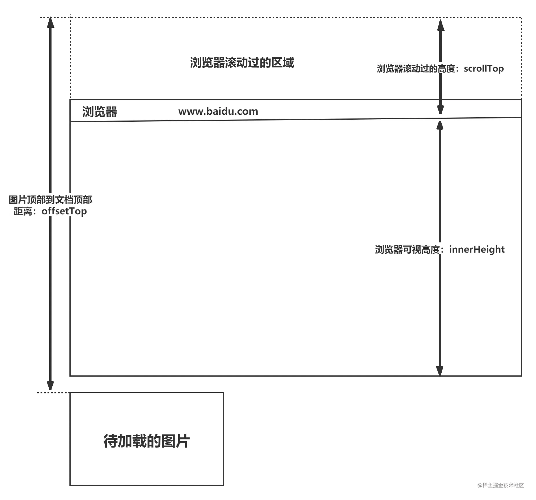
# 如何判断元素是否到达可视区域
- window.innerHeight 是浏览器可视区的高度;
- document.body.scrollTop || document.documentElement.scrollTop 是浏览器滚动的过的距离;
- imgs.offsetTop 是元素顶部距离文档顶部的高度(包括滚动条的距离);
- 内容达到显示区域的:img.offsetTop < window.innerHeight + document.body.scrollTop;
- code
<div class="container">
     <img src="loading.gif"  data-src="pic.png">
     <img src="loading.gif"  data-src="pic.png">
</div>
<script>
var imgs = document.querySelectorAll('img');
function lozyLoad(){
		var scrollTop = document.body.scrollTop || document.documentElement.scrollTop;
		var winHeight= window.innerHeight;
		for(var i=0;i < imgs.length;i++){
			if(imgs[i].offsetTop < scrollTop + winHeight ){
				imgs[i].src = imgs[i].getAttribute('data-src');
			}
		}
	}
  window.onscroll = lozyLoad();
</script>
1
2
3
4
5
6
7
8
9
10
11
12
13
14
15
16
17
2
3
4
5
6
7
8
9
10
11
12
13
14
15
16
17
- 图片懒加载(imgLazyLoad): 36 个 JS 手写题 (opens new window)
let imgList = [...document.querySelectorAll('img')]
let length = imgList.length

// 修正错误,需要加上自执行
const imgLazyLoad = (function() {
  let count = 0

   return function() {
        let deleteIndexList = []
        imgList.forEach((img, index) => {
            let rect = img.getBoundingClientRect()
            if (rect.top < window.innerHeight) {
                img.src = img.dataset.src
                deleteIndexList.push(index)
                count++
                if (count === length) {
                    document.removeEventListener('scroll', imgLazyLoad)
                }
            }
        })
        imgList = imgList.filter((img, index) => !deleteIndexList.includes(index))
   }
})()

// 这里最好加上防抖处理
document.addEventListener('scroll', imgLazyLoad)
1
2
3
4
5
6
7
8
9
10
11
12
13
14
15
16
17
18
19
20
21
22
23
24
25
26
2
3
4
5
6
7
8
9
10
11
12
13
14
15
16
17
18
19
20
21
22
23
24
25
26
# a 伪类的顺序
link visited hover activelink:平常的状态visited:被访问过之后hover:鼠标放到链接上的时候active:链接被按下的时候
a:link {
  background-color: blue;
}
a:visited {
  background-color: pink;
}
a:hover {
  background-color: purple;
}
a:active {
  background-color: yellow;
}
1
2
3
4
5
6
7
8
9
10
11
12
2
3
4
5
6
7
8
9
10
11
12
- noreferrer/noopener
<a
  href="https://an.evil.site"
  target="_blank"
  rel="noopener noreferrer nofollow"
  >a链接</a
>
1
2
3
4
5
6
2
3
4
5
6
# 解决 IE9 不能使用 opacity
opacity: 0.5;
filter: alpha(opacity = 50);
filter: progid:DXImageTransform.Microsoft.Alpha(style = 0, opacity = 50);
1
2
3
2
3
# html 转义符
`×;` -> `×`
` ` 半角的不断行的空白格(推荐使用)
` ` 半角的空格
` ` 全角的空格
1
2
3
4
5
6
7
2
3
4
5
6
7
- 兼容
<!-- cc:ie6 快捷键 -->
<!--[if lte IE 8]>
  <script src="http://cdn.bootcss.com/html5shiv/r29/html5.js"></script>
<![endif]-->
1
2
3
4
2
3
4
# 页面三层结构
结构层HTML表现层CSS行为层JavaScript
# css font-family
@font-face {
  font-family: Emoji;
  src: local("Apple Color Emojiji"), local("Segoe UI Emoji"), local("Segoe UI Symbol"), local("Noto Color Emoji");
  unicode-range: U+1F000-1F644, U+203C-3299;
}
body {
  font-family: system-ui, —apple-system, Segoe UI, Rototo, Emoji, Helvetica, Arial, sans-serif;
}
1
2
3
4
5
6
7
8
2
3
4
5
6
7
8
- 衬线字体
.font-serif {
  font-family: Georgia, Cambria, "Times New Roman", Times, serif;
}
1
2
3
2
3
- 等宽字体
.font-mono {
  font-family: Menlo, Monaco, Consolas, "Liberation Mono", "Courier New", monospace;
}
1
2
3
2
3